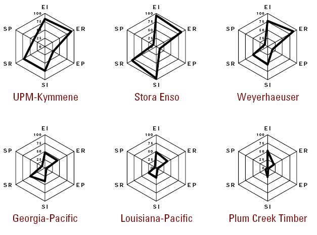
There is this trend that seems to be popping up everywhere of using radar charts such as this one:

For the record people, these are bad. They imply that there is some circular relationship about your data points. They are line graphs made into a circle. If you want to indicate the volume under a curve, make a line graph, fill the area under your curve, and then consider it done. Don’t use these unless your data points progress from A → B → C and then back to A.
Please?
EDIT: I should add - don’t use line graphs for things that don’t progress from A to B to C either. For those things, use bar graphs, or column graphs.
I love getting feedback and comments. Make my day by making a comment.
comments powered by Disqus