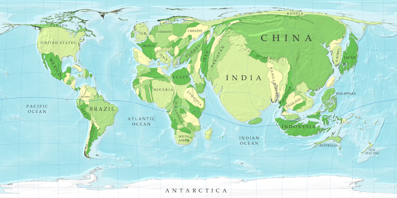
I stumbled across some incredible maps yesterday while looking at some maps of the status of the American election.
These maps use the Gastner and Newman algorithm (don’t ask me for details) to stretch a map to make sizes of countries correspond with some datum of interest. Generally, we study geography as a separate topic from useful stats, but these pictures show which countries are really important, and which might be candidates for less emphasis.
For example, we can take the map of the world, and stretch it so that we can see where the population of the world is located:
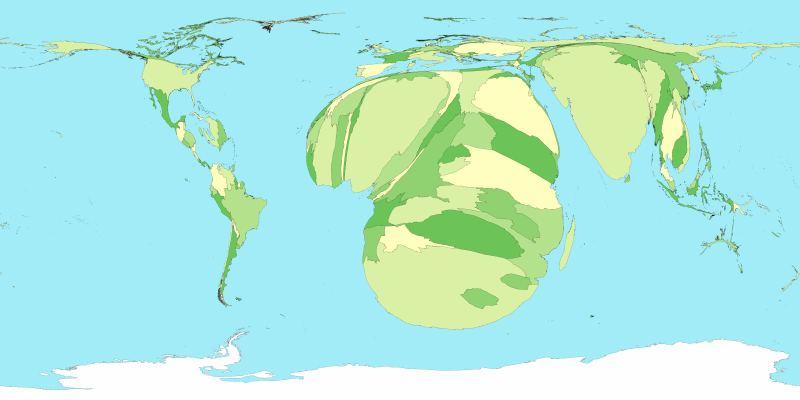
Or we can analyze where the highest rates of HIV/AIDS can be found:
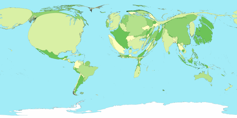
Or total spending on health care (no surprises here):
Pretty interesting stuff. This link includes more of these, and also software for making them yourself.
I love getting feedback and comments. Make my day by making a comment.