OK, here’s the scoop. I’ve given the site a major revamp and a new look.
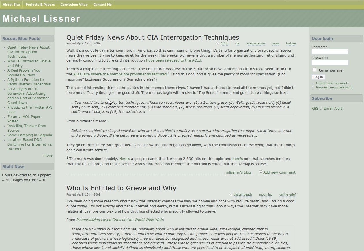
Here’s the old one:

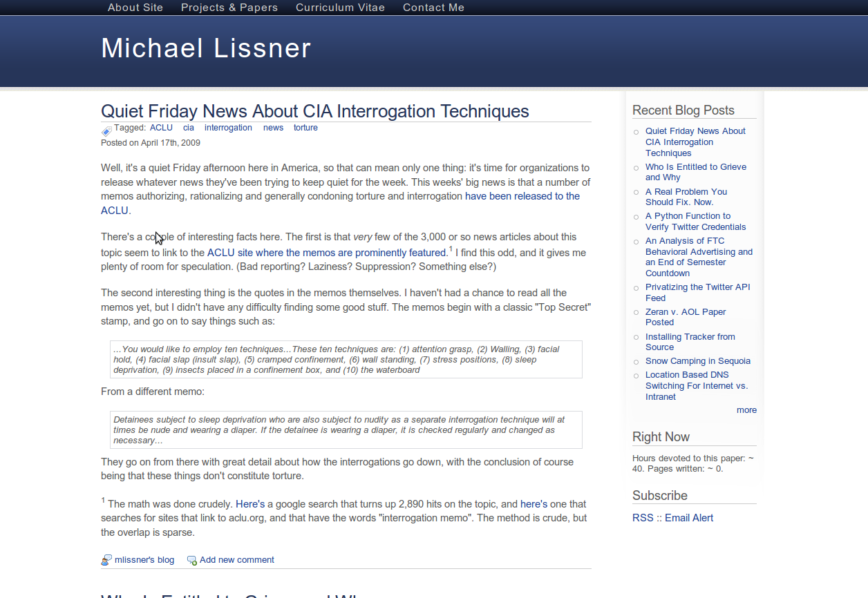
And the new:

There were a number of reasons I wanted to make a change, and I think the new design accomplishes most of them. First, I wanted to change to a static width layout. It was a long time coming, and now people with big screens and/or high resolution won’t have to deal with ridiculous line lengths. Second, the new design should do wonders for links, which didn’t really stand out before. Third, I’ve dropped the login box at the right, since I was the only one that ever logged in. Actually, I’ve dropped the whole column, so we’re down to two columns now, not three.
Something I wasn’t really planning on doing was the color change. I liked the muted greens, but I think the topics I discuss have largely moved away from environmental ones, so perhaps the blue makes more sense and will better evoke what I’m going for.
Thoughts? Bugs? Comments?
I love getting feedback and comments. Make my day by making a comment.