I’ve been playing around lately with concepts to make Firefox more useful on my laptop, and I’ve come up with a few solutions I thought I would share. The idea here is to take the best concepts from Chrome and Safari, and apply them to Firefox. These changes will maximize your use of screen real estate, and will make Firefox a little easier to use at the same time.
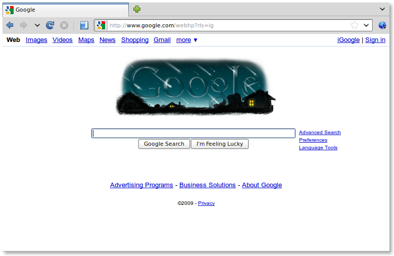
Once these are set up, Firefox will look like this:

These changes do the following:
- Reduce the status bar to 1px at the bottom of the screen
- Reduce the menu bar to a small icon to the right of the URL bar (like Chrome)
- Move the tabs to the top of the browser (like Chrome)
- Highlights the domain part of each URL (like Chrome)
- Make links appear in the URL bar when you hover over them (since the status bar is eliminated)
- Show a progress bar in the URL bar rather than in the status bar (like Safari)
The changes that are needed to enable all this are a bit complicated, but not too bad:
- Eliminating the status bar at the bottom of the screen creates about 35 pixels of vertical space that is otherwise not used for very much. By making it only one pixel, hovering over the bottom of your browser window will pop it up, in case you need it. To do this, you need the Stylish extension, and this Stylish script.
- Reducing the menu bar to only a small icon achieves the same goal of creating screen space. To do so, I recommend the Compact Menu extension. A word of warning though: this one takes some configuration after installation. (The Tiny Menu extension will also work, but you can’t move the icon to the right-hand side, which makes the back button much more difficult to use.)
- After some consideration, I decided to move my tabs above the URL bar because the URL bar and the associated buttons really do apply to whatever page is being displayed. Which is to say that the URL is part of the tab, and should be displayed under it - not vice versa. To make this change is pretty easy - simply install the Stylish script found here.
- Highlighting the domain in the URL bar, and graying out the rest is a simple and useful trick that helps to avoid scam sites that might be trying to impersonate a valid web site. To make this change, simply install the Locationbar2 extension.
- Since we eliminated the status bar, one thing we’ll need back is the ability to see where a link takes us before we click on it. By making it appear in the URL bar rather than the status bar, our eyes only need to look in one place, and the result of clicking on a link is shown to us before we click on it. To make this change, there is a setting in the Fission extension, which is also used to display progress in the URL bar.
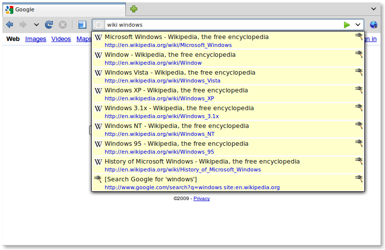
You might note at this point that in the screenshot above that I’ve also eliminated the search box from the navigation toolbar, thus allowing more space for the URL bar. To replace the search box’s functionality, I recommend the Cybersearch extension, which uses keywords in the URL bar to complete searches. For example, if I type “wiki windows,” it gives me the top ten wikipedia pages for the term windows:

This also works for Google and Amazon, and just about any other site you can think of.
Once all of this is completed, you should have created about 70 vertical pixels of new space in your browser, maintained all the previous functionality, and improved the usability of a couple of tasks.
I love getting feedback and comments. Make my day by making a comment.